FGC:OP Cut 068: Difference between revisions
Jump to navigation
Jump to search
UrsusArctos (talk | contribs) No edit summary |
No edit summary |
||
| (4 intermediate revisions by 2 users not shown) | |||
| Line 4: | Line 4: | ||
</noinclude>{{FGC:Cut|episode=OP | </noinclude>{{FGC:Cut|episode=OP | ||
|cutname=068 | |cutname=068 | ||
|images= | |images=[[Image:OP_C068.jpg]] | ||
|cutnumbertext=[[FGC:OP Cut 068|068]] | |cutnumbertext=[[FGC:OP Cut 068|068]] | ||
|script= | |script= | ||
{{FGC:Script Text|type=description | {{FGC:Script Text|type=description | ||
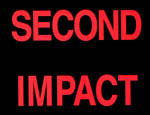
|text= | |text="SECOND IMPACT"}} | ||
|comments= | |comments= | ||
{{FGC:Comment|name= | {{FGC:Comment|name=Someone | ||
|comment= | |comment="SECOND IMPACT" is in red coloured font, while the other text is in white coloured font. I wonder why is this so?}} | ||
}} | }} | ||
<noinclude>}} | <noinclude>}} | ||
[[Category: FGC Cuts]] | [[Category:FGC Cuts]] | ||
[[Category: FGC | [[Category:FGC OP Cuts]] | ||
</noinclude> | </noinclude> | ||
Latest revision as of 21:53, 28 December 2009
| Screenshots | Cut # | Description/Dialogue | Commentary | ||
|---|---|---|---|---|---|
| 068 |
|
|

